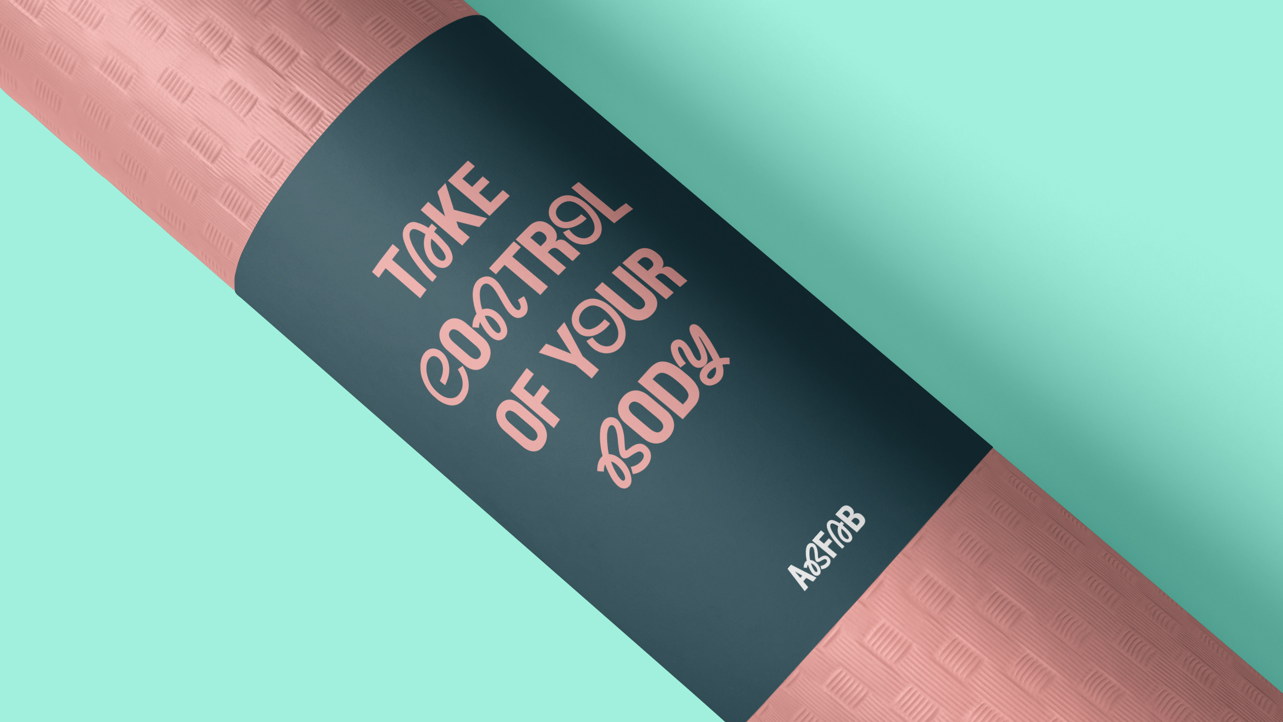
ABFAB Fitness
AbFab Fitness is an innovative local gym that is exclusively designed for women. Offering a unique blend of strength training, movement-based workouts, personalised training sessions, yoga classes, and comprehensive gym facilities. The studio aims to create a supportive and empowering environment where women can achieve their fitness goals and enhance their physical and mental well-being.
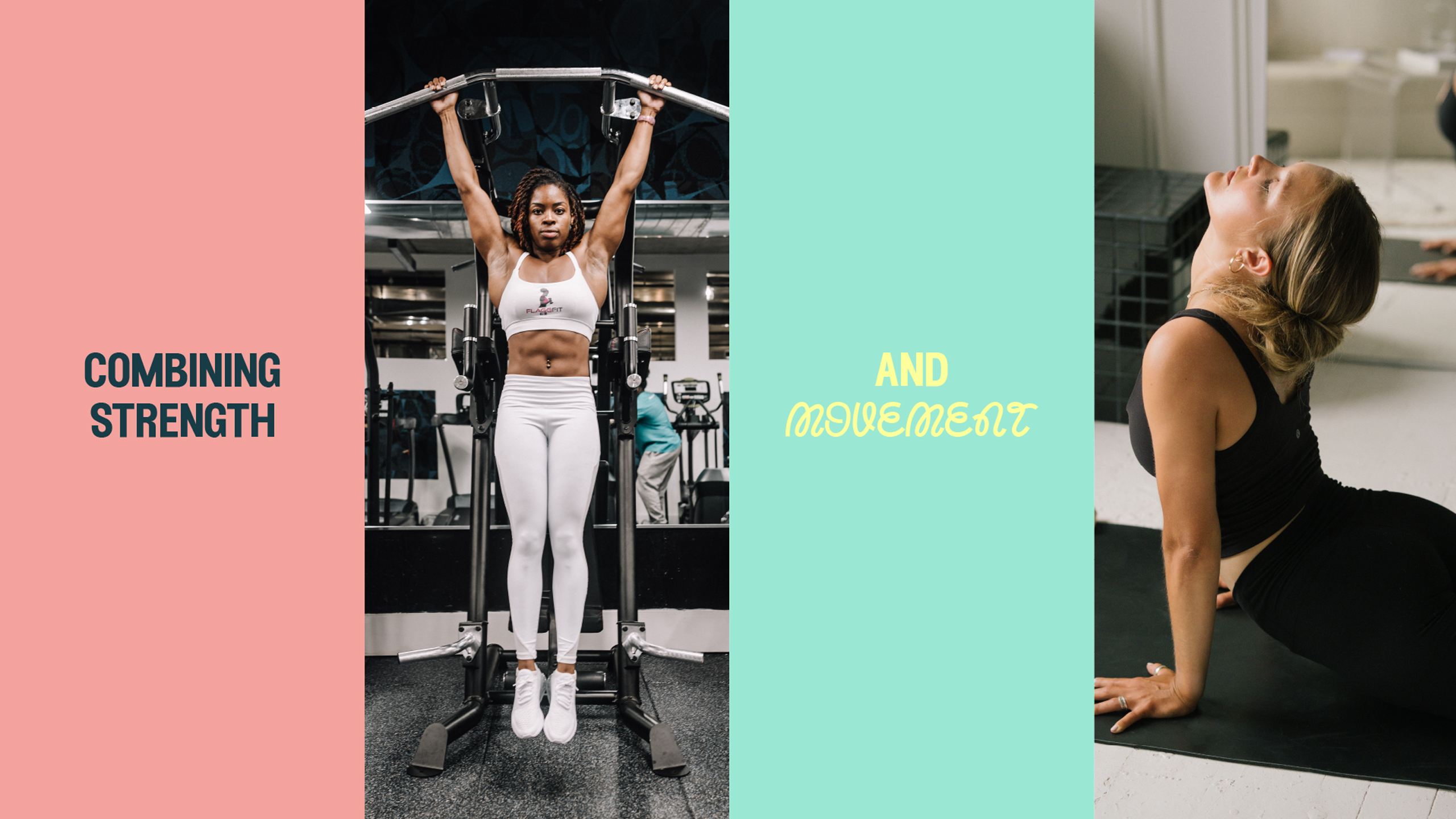
Form and function in harmony
The task involved creating a logo that effectively captured the variety of AbFab’s offerings. As a fitness company that extends beyond conventional gym routines and personalised training, the challenge lay in devising a brand identity capable of blending their array of services, without relying on conventional fitness visuals. Simultaneously, the aim was to evade the predictable use of feminine clichés.
Fit, fabulous and female
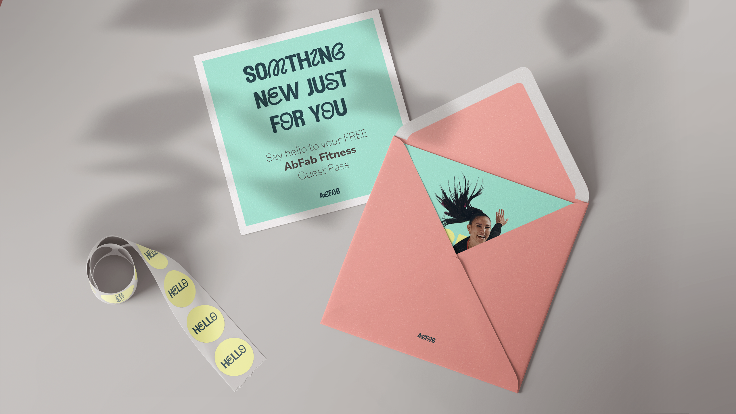
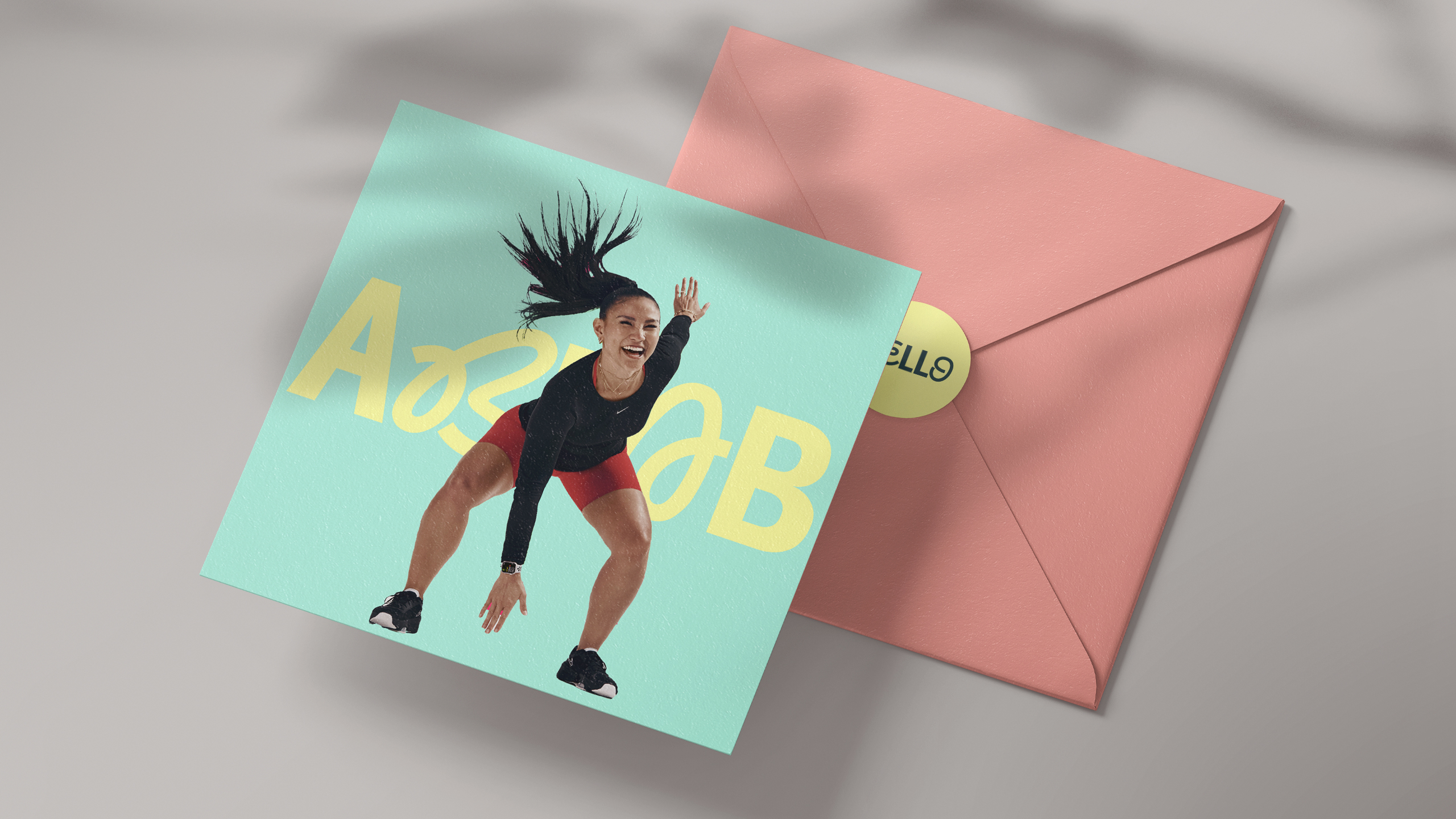
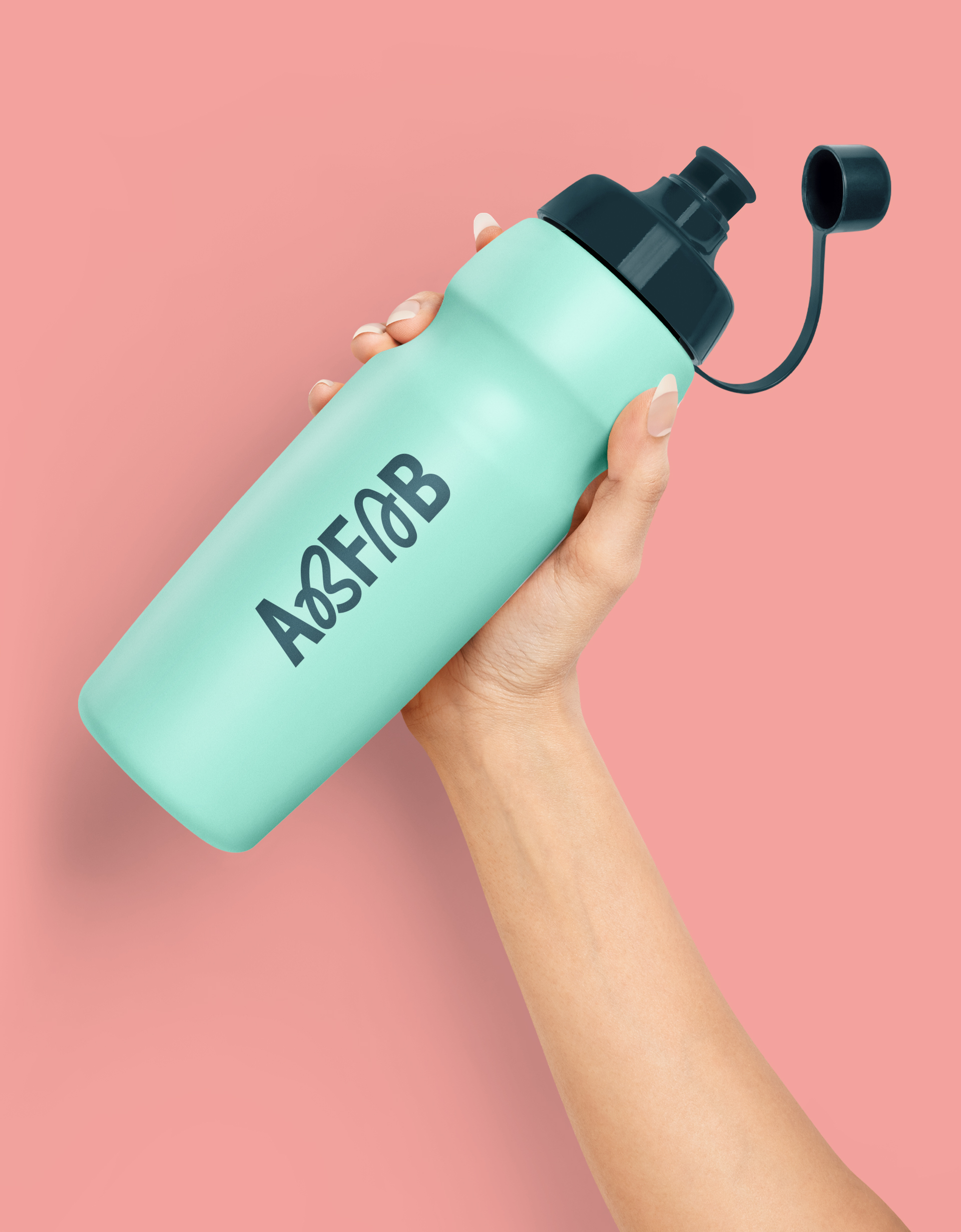
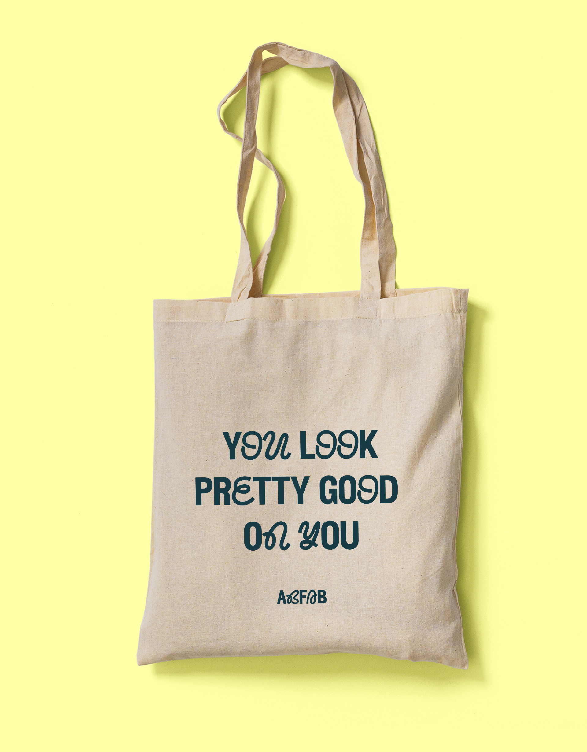
AbFab Fitness distinguishes itself through its unique blend of strength training, dynamic workouts, accompanied by personalised training sessions, which are exclusively tailored to women. The concept was to employ typography as a medium to reflect this diverse range. By integrating specific letters that use a pronounced sense of motion, and combining them with the strength and stability of a sans-serif font, I created a multi-dimensional logo. In terms of colour, I curated a fresh and invigorating palette featuring gentle pastel shades. This choice harmonises seamlessly with AbFab Fitness’s holistic approach, encapsulating the essence of their intended wellness offering.
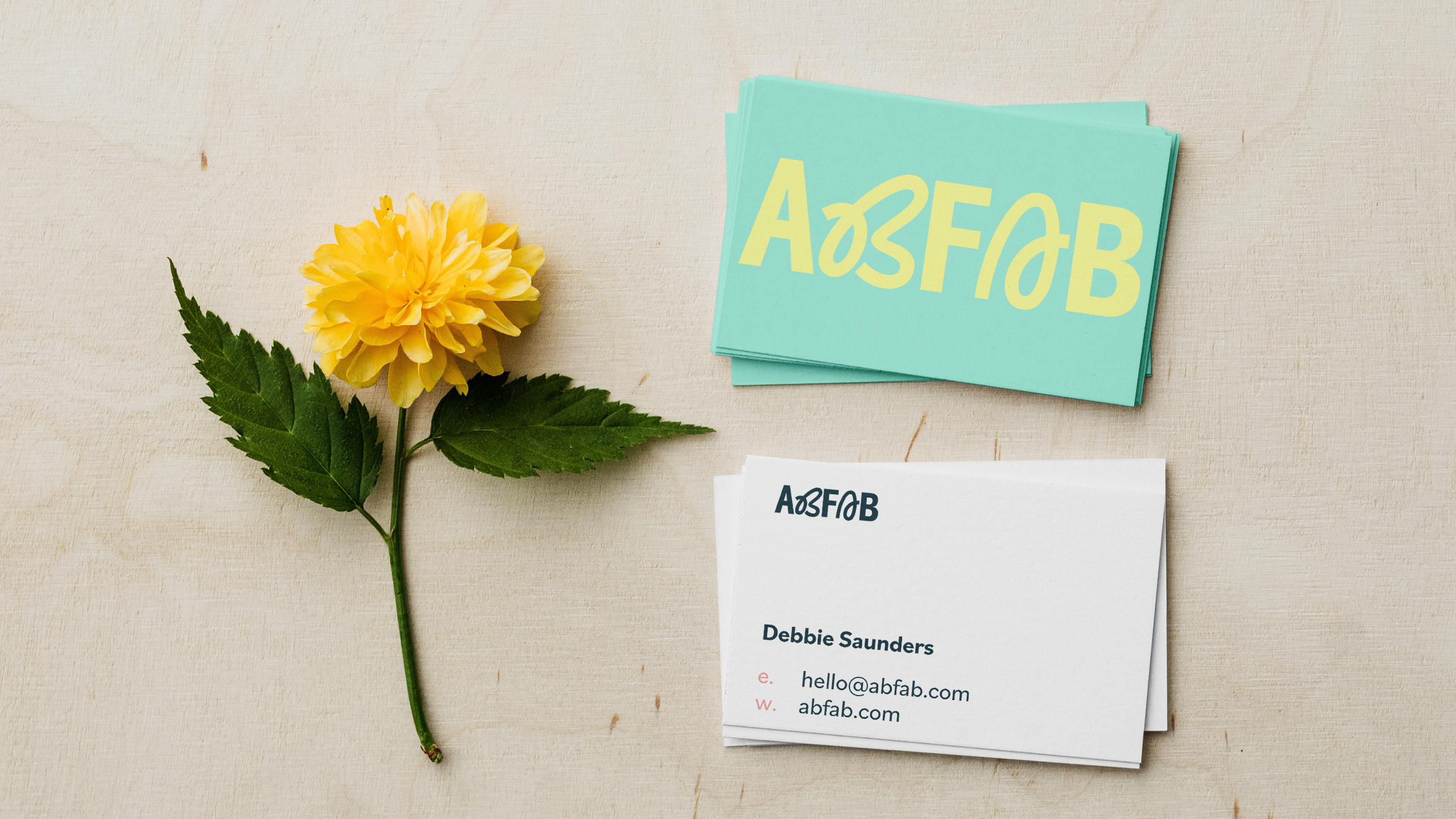
AbFab Fitness is a comprehensive fitness destination for women seeking a holistic approach to wellness. By blending strength training and flowing movement-based workouts and a sense of community, the studio will empower women to achieve their fitness aspirations, improve their well-being, and thrive in a supportive environment tailored to their unique needs.
